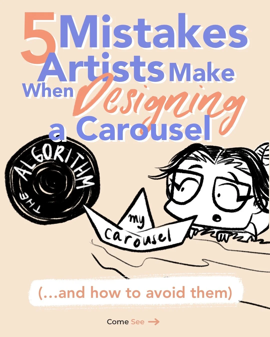
5 Mistakes Artists Make When Designing Instagram Carousels (and How to Avoid Them)
If you’ve been posting your art on Instagram for a while, you’ve probably noticed that carousels still perform surprisingly well in 2025. They keep people swiping, saving, and sharing — which is basically Instagram’s love language.
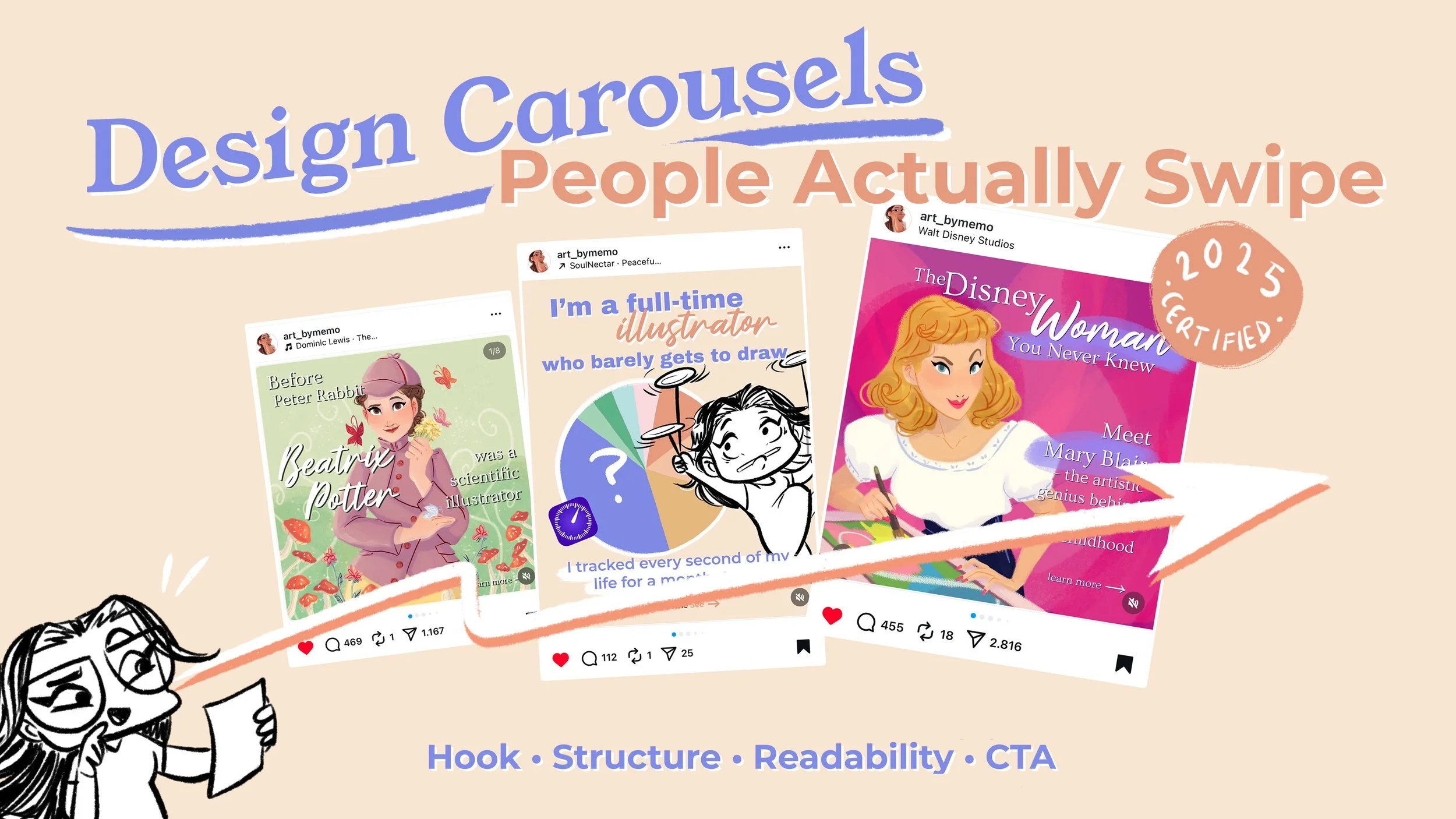
But here’s the catch: not all carousels are created equal. I learned that the hard way this year, when I accidentally stumbled into a structure that transformed my reach overnight. My Women in Art series started in March, and one of those carousels (Mary Blair, queen of colour and whimsy) reached hundreds of thousands of people. It also came with a lot of comments like:
“Love this… but I can’t read it, the font is too tiny.” 💀
Ouch. But also… fair.
That’s when I realised: it’s not just about what you post, it’s about how you design and structure it.

‘Mary Blair’ carousel post in my Women in Art series
The 5 Most Common Mistakes I See (and Made Myself)
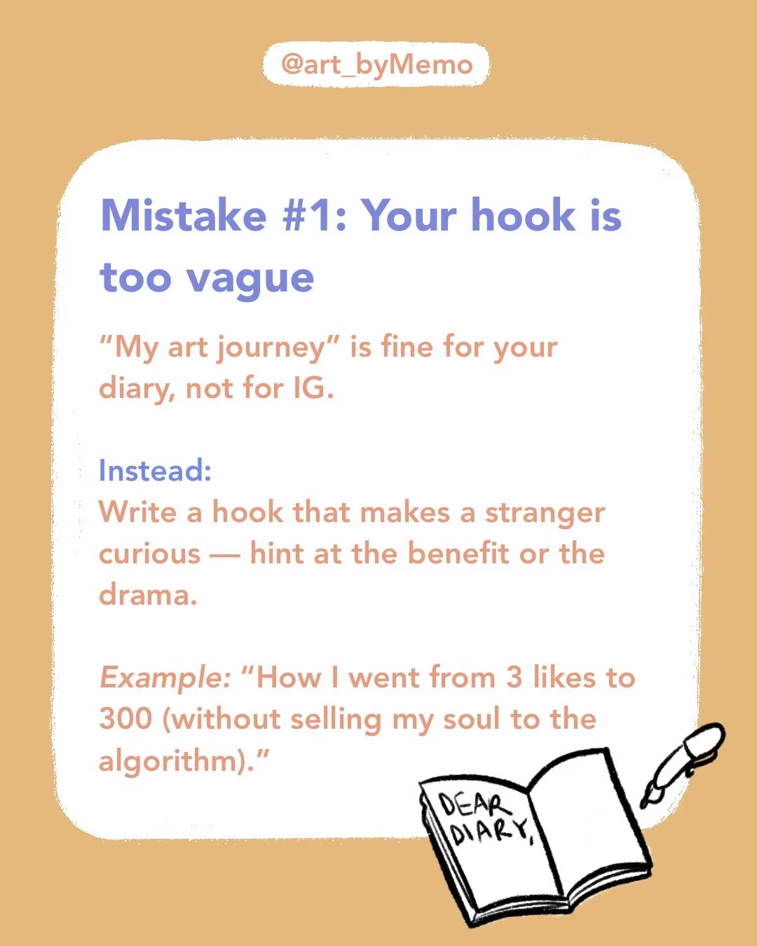
1. Vague hooks.
“My art journey” is lovely for your diary, but it won’t make strangers swipe. Be specific. Make your first slide irresistible.
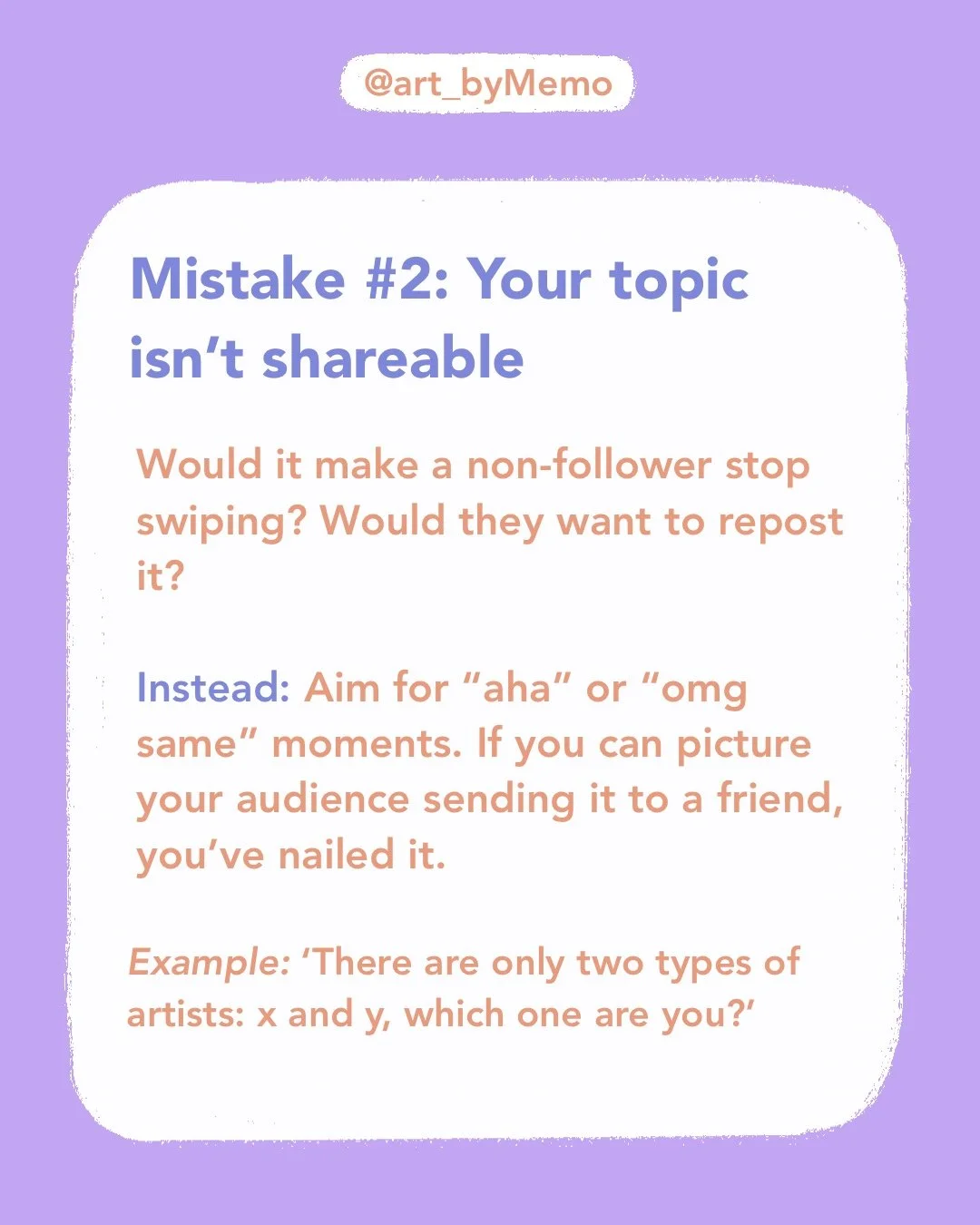
2. Topics that aren’t shareable.
Ask yourself: would a non-follower stop for this? Would they repost it? If not, reframe it.
3. Text walls.
Two or three short lines per slide is plenty. No one came to Instagram to squint through an essay.
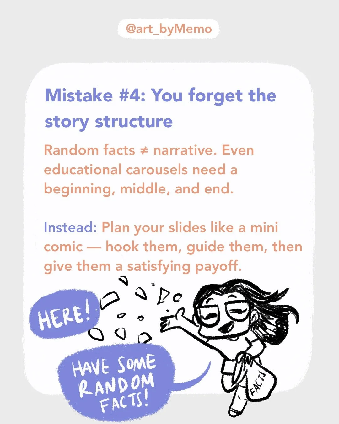
4. No story structure.
Even educational carousels need a beginning, middle, and end. Treat them like mini comics: hook → insight → payoff.
5. No CTA.
If you don’t tell people what to do next (comment, save, share, click), they probably won’t.
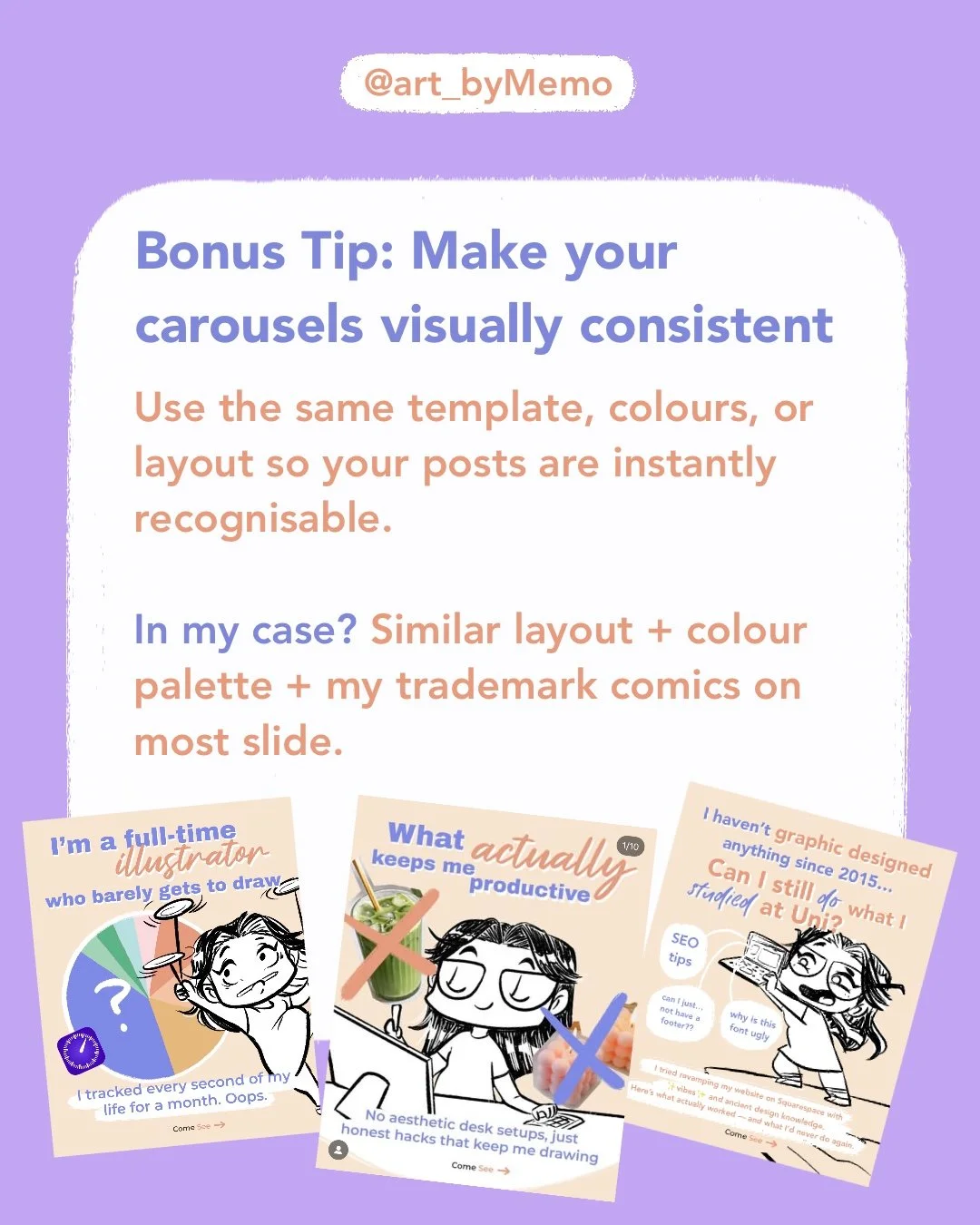
Bonus Tip: Consistency is Key
One thing I’ve learned from posting multiple carousels this year is that recognisability matters. Use a consistent colour palette, fonts, or recurring layout. In my case, I use bold text blocks and little comics — people now recognise my posts mid-scroll before they even see my name.


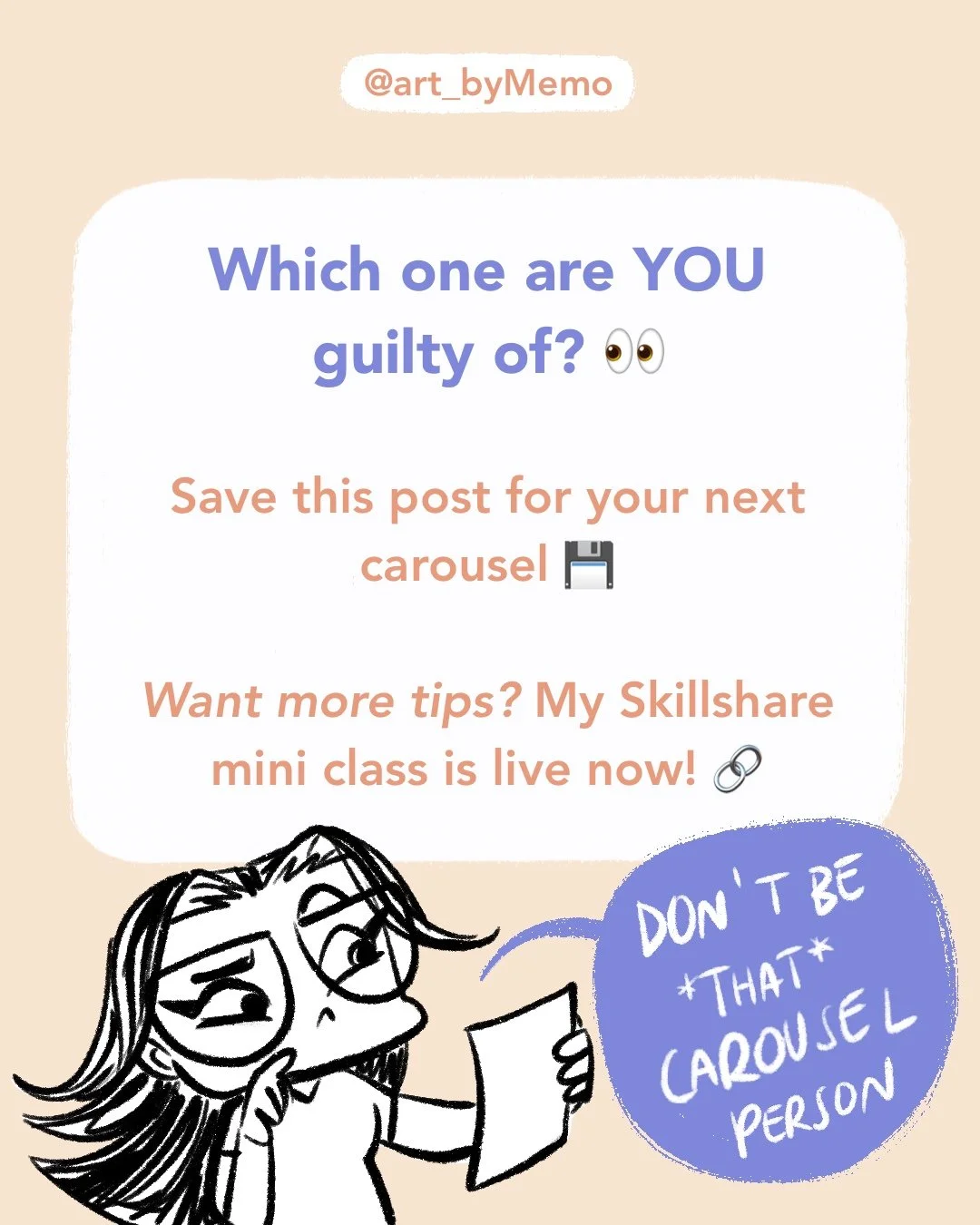
Free Cheat Sheet (and a Deeper Dive)
I know it’s a lot to keep in your head, so I made a free resource:
👉 Download The Carousel Cheat Sheet on Gumroad
It’s a 5-page quick guide to avoid the biggest mistakes and design carousels that are swipe-worthy.
If you want the full step-by-step structure, my design process, and the extended cheat sheet, you’ll find all of that in my new Skillshare mini class:
👉 Watch How to Create a Killer Carousel for Your Art Account on Skillshare
It’s just 15 minutes long, super practical, and you can even join with a 1 month free trial of Skillshare if you’re new to the platform.
My latest mini class on Skillshare - How to Create a Killer Carousel for your Art Account in 2025
✨ Whether you’re just starting out or trying to breathe new life into your account, carousels are still one of the best tools artists can use in 2025. And trust me — if they could revive my account after years of bitter disappointment, they can work for you too.
psssst. Did you know I’m working on a Kids Lit project that features Forgotten Women in Art? Check out the pitch over in my Portfolio!